top of page

Task Performance
Vibrotactile feedback meaningfully reduced interaction inefficiency, reducing
unnecessary taps across most tasks.
While neither group reached the optimal tap count, the vibrotactile group consistently performed better on two of the three tasks.
For the headlights task, participants averaged 5.7 taps compared with 13.3 taps in the control group, and for mirror adjustment, 5.7 taps versus 8.1 taps. The climate subtasks were the exception, with the control group outperforming the experimental group, suggesting that the effectiveness of vibrotactile feedback varied depending on interface-specific factors explored in 'Implications'.


1/4
Spatial Distribution of Each Participant’ s First Tap
Perceived Workload
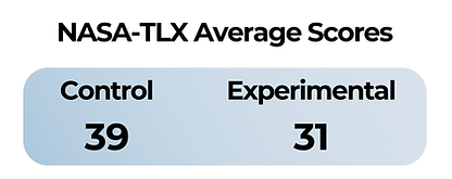
The experimental (vibrotactile) group reported
meaningfully lower overall NASA-TLX workload scores.
Among the six dimensions, the largest gaps between the
control vs. experimental groups appeared in:
-
Mental Demand: 49 vs. 30
-
Effort: 52 vs. 36
-
Frustration: 43 vs. 35
The pattern across subscales points to a consistent theme: vibrotactile feedback made the interface feel less mentally taxing and less frustrating to use, even when task performance indicated navigational complexity of the interface.
Qualitative Findings:
Post-Task Interview
User Experience
Multi-step navigation and information-dense menus created inconsistent usability friction across both groups, with haptic feedback serving as a meaningful but incomplete counterbalancing cue for reducing visual verification behavior.
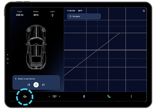
Main menu, 'Car menu' icon circled in blue

'Car menu' icon expanded
Across both groups, the 'car menu' icon was the most frequently cited source of difficulty, described as overwhelming, overstimulating, and requiring sustained visual attention.


“it's overstimulating, there’s too much going on with not enough guidance or structure provided by the interface.
It’s just…thrown on there, and the onus is on the driver, the user, to figure out how to work it, and it doesn’t provide any…help.
Erin, Experimental
The mirror task was identified as the most difficult across both groups due to its multi-step navigation path and infrequent use in daily driving.
Vibrotactile feedback served as a critical input registration cue.
Participants noted that the vibration allowed them to confirm whether a tap had registered without visual verification, observing that without it, they would “just be clicking anything” and not know what they were clicking on.
The more confirmation the driver can get without having to take their eyes off the road, the better...[it] almost like checks a box in my head that I otherwise would need to check off with visual cues.
Frances, Experimental
However, a substantive design critique surfaced:
Vibrotactile feedback elicits a vibration every incremental tap when adjusting the temperature, rather than on task completion. This created cognitive confusion because the vibration signal did not distinguish between progress and completion.
This finding points to a critical gap between the presence of vibrotactile feedback and its strategic implementation.
Attitudes Toward Touchscreen Interaction While Driving
Nearly every participant across both groups noted that their composure during the study was attributed to the vehicle being stationary. This reveals a shared underlying anxiety about the real-world safety implications of touchscreen IVIS.
Perceived safety responses were consistently negative across both conditions, with vibrotactile feedback partially but not fully alleviating safety concern in the experimental group.
It’s crazy to me you can't be on your phone while driving, but you're allowed to have something that's like 10 times the size permanently installed in front of you.
Noah, Experimental
[Touchscreens are] the worst car interface that’s ever been invented in terms of safety and mental load...[they're] fundamentally impossible in actual traffic conditions.
Cameron, Experimental

In the control group, mental demand was consistently attributed to multi-step navigation
and the absence of any non-visual confirmation.
Participants described their experience as having “tunnel vision” when the car menu opened, becoming so focused on parsing the information that they lost broader situational awareness of the interface and the outside environment. They noted the absence of tactile feedback removed the kind of anchoring they relied on in their own cars, where knob-based controls allowed them to adjust settings without diverting excessive visual attention from the road.
Consumer Preferences
Findings revealed a functional hierarchy that points toward a hybrid interface model.
Participants converged on a hybrid interface model that reserves tactile or haptic-enabled controls for safety-critical functions while accepting touchscreens for secondary features.
Participants across both groups identified the same categorical divisions. Functions such as high beams, mirror adjustment, windshield wipers, and climate controls should be tactile or haptic-enabled. Navigation, music, and Bluetooth were acceptable or preferred on a touchscreen.
Essential functions and safety-related things should not have to be searched on a screen.
Lucas, Control
This convergence across conditions suggests the preferences reflects a deeper usability principle about the importance of control functions rather than a reaction to the haptic condition specifically.

bottom of page